“Claude Design just killed designers,” said the people who’ve never had to move something 8px to the left.
** Daily design-is-alive, positive, handcrafted pills.
Meanwhile, designers using it:
> The same, but the third box on the fourth row of the grid needs to be pushed 8px to the left, while keeping the third icon in the second row of the grid as is.
“God... just give me mouse control.”
For real, is that what you non-designer folks think? That we’ll be typing for UIs?
That’s the future: we type for art?
We type for films, UIs, interior design...
We create buildings by typing, then live inside them...
Am I the only one seeing chat boxes as a transition affordance here?
Is this too hard to spot?
That the chat interface is the most convenient “ship-fast” UI for something that does “too much.”
That users’ brains are being trained to use an affordance for the convenience of the shipper. That this affordance may stay in the future, but not for core tasks?
The real co-pilot affordances are yet to come. And they will be built by, and for, the crafty, not the “brave” typers.
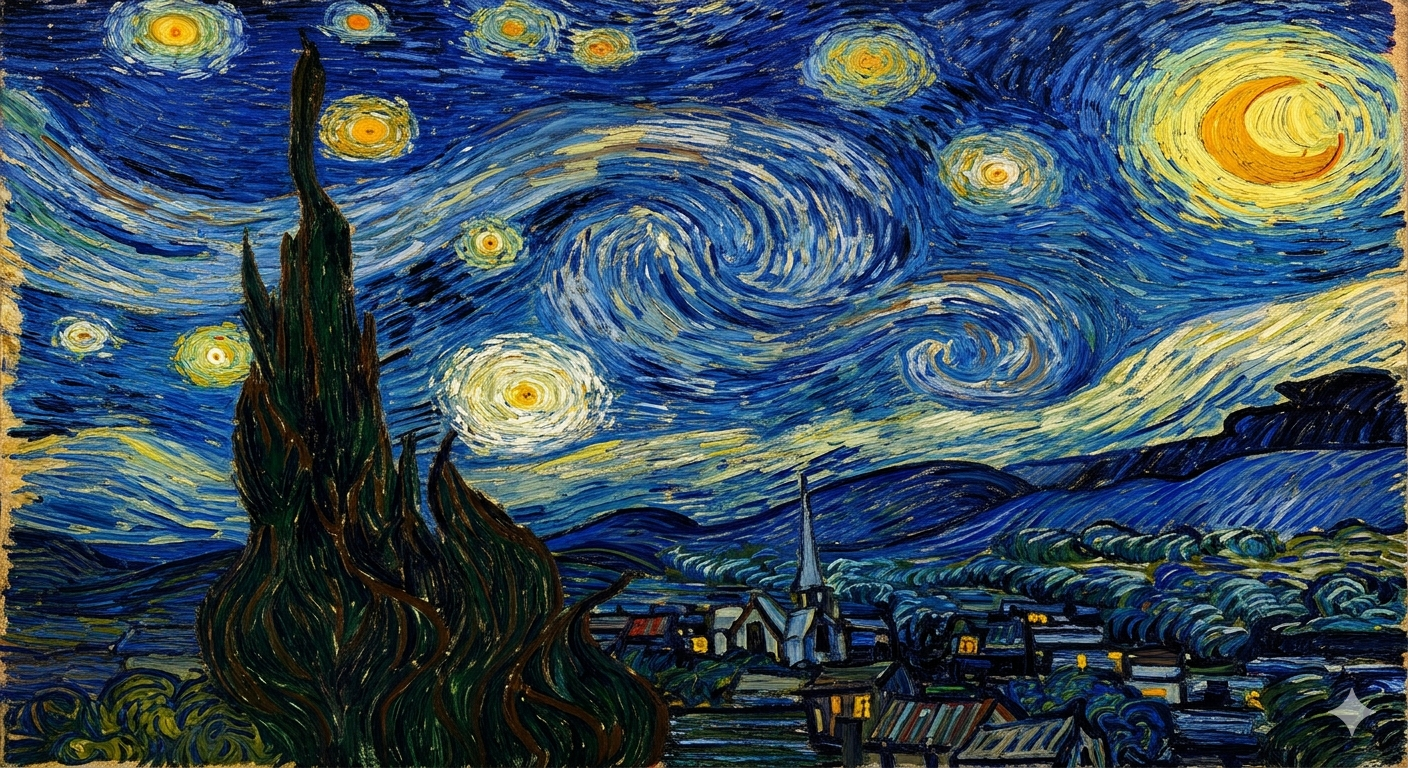
For now, if you are happy typing for art, you can have *Starry Night*:
“A dreamlike night landscape with a swirling blue sky, luminous yellow stars, a glowing crescent moon, a tall dark cypress in the foreground, and a peaceful village below, painted with thick expressive brushstrokes, intense movement, bold post-impressionist oil texture, vibrant blues and golds, emotional, iconic, highly detailed.”
(try it)
Maybe the MoMA should hang this prompt instead?